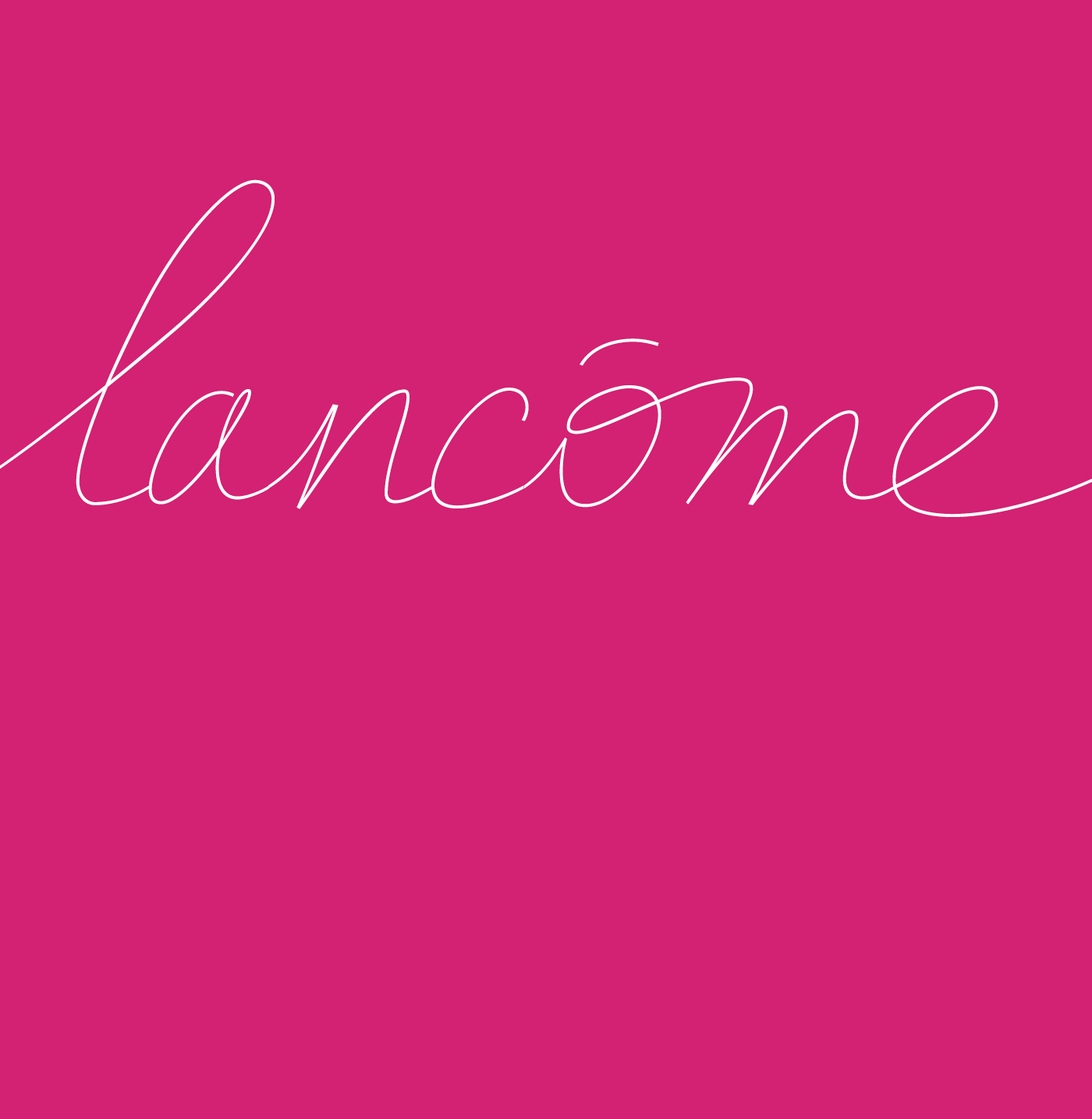
Lancôme Custom Script Typeface
The Lancôme typography was designed for the Publicis 133 agency in 2004.
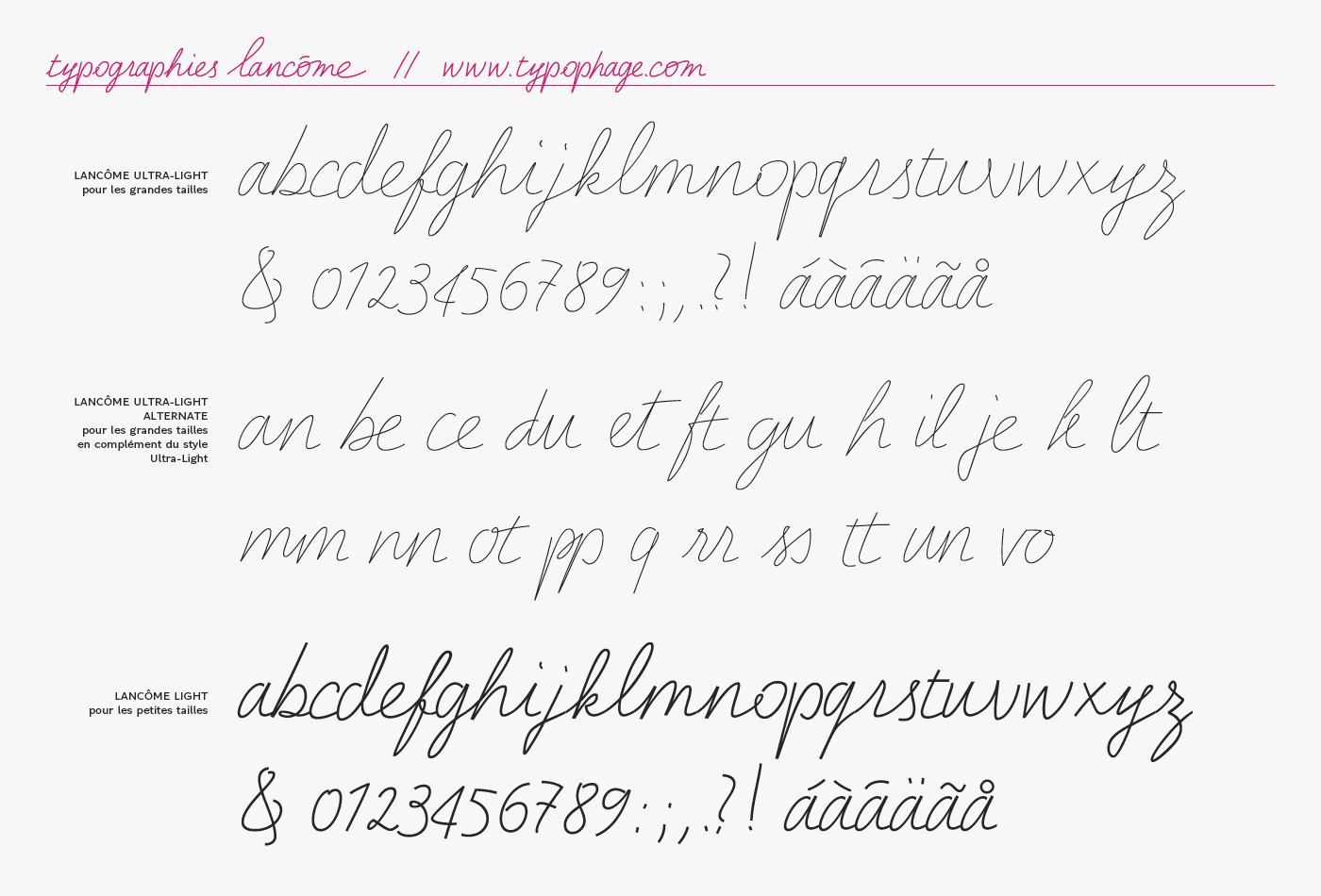
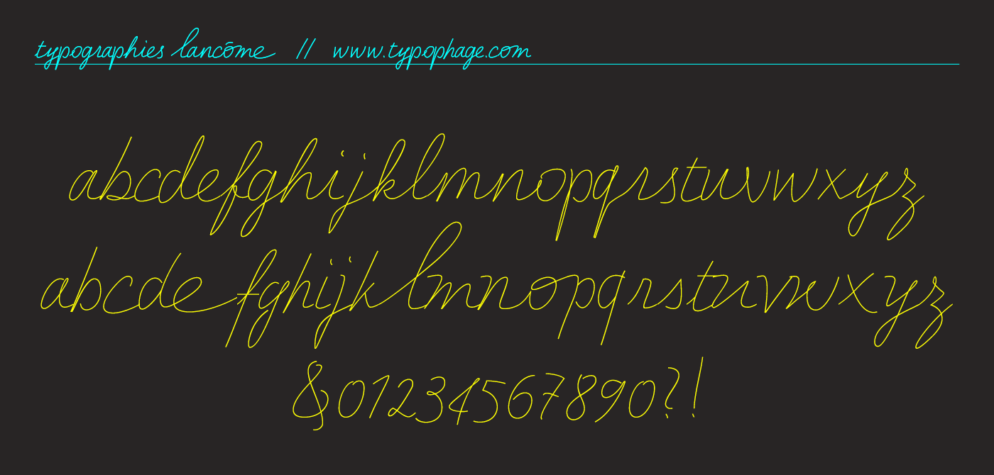
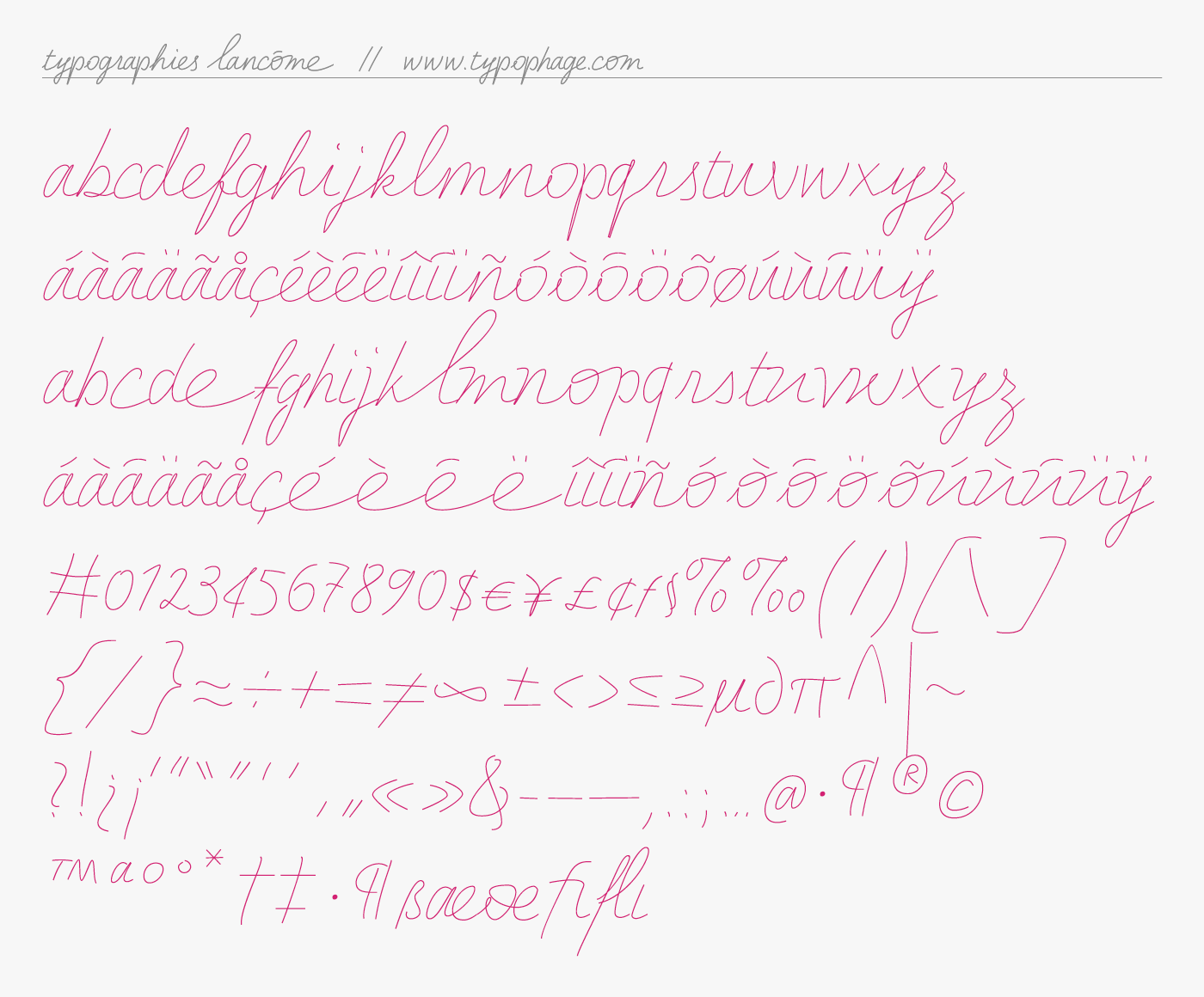
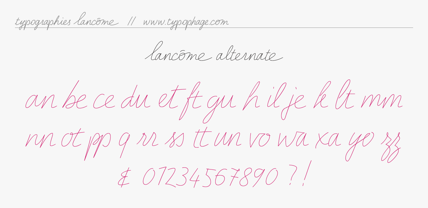
Three styles have been designed: Lancôme Extra Light, Lancôme Extra Light Alternate and Lancôme Light.
The Extra Light version is the base. The alphabet all lowercase was drawn on a layer and then digitized.
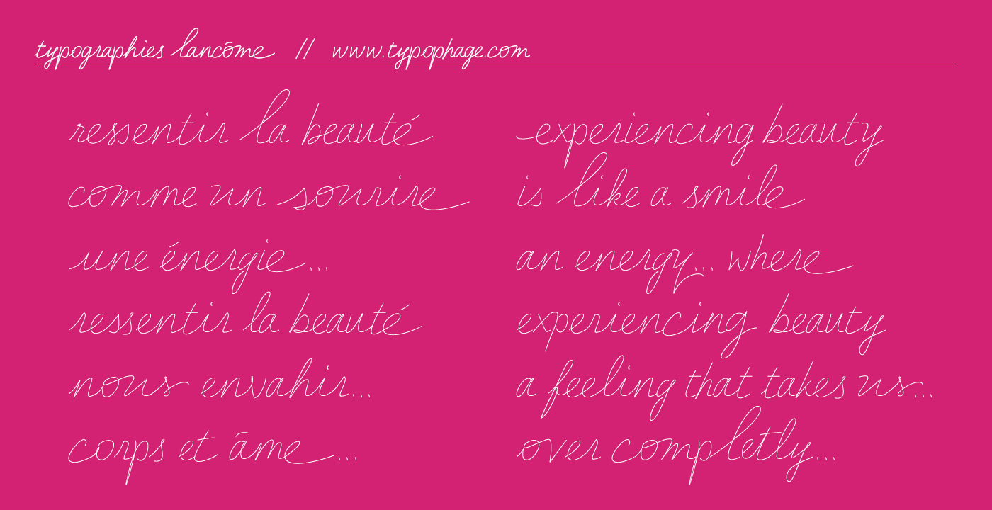
This writing evokes lightness and femininity.
This writing evokes lightness and femininity.
A second lowercase alphabet replaces uppercase letters, which makes it possible to use 2 versions in the same font.
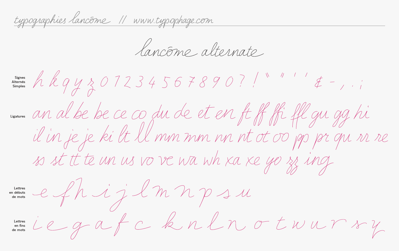
The Extra Light Alternate version features different characters, with ligatures, start letters or end of word to get a more natural writing.
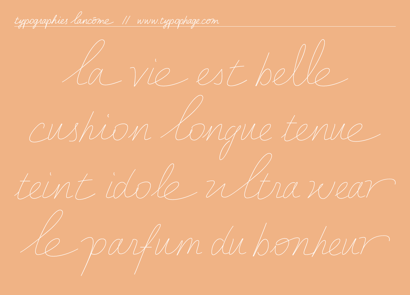
The Light version is slightly thicker for texts in smaller sizes.